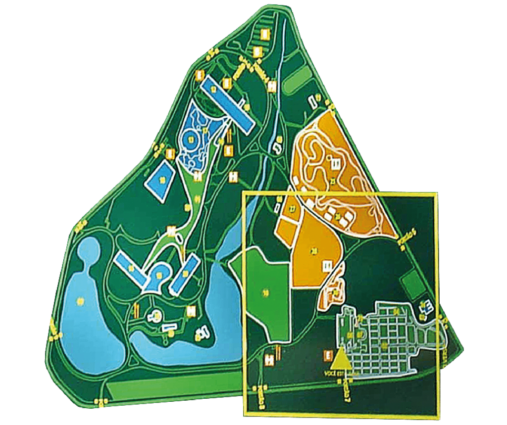
discovering the park
we developed a communication system that organizes and enhances the experience of living the Ibirapuera Park.
Client: Banco Real, Banco Santander e Prefeitura Municipal de São Paulo

BRAND AND LOGO
the name, the brand
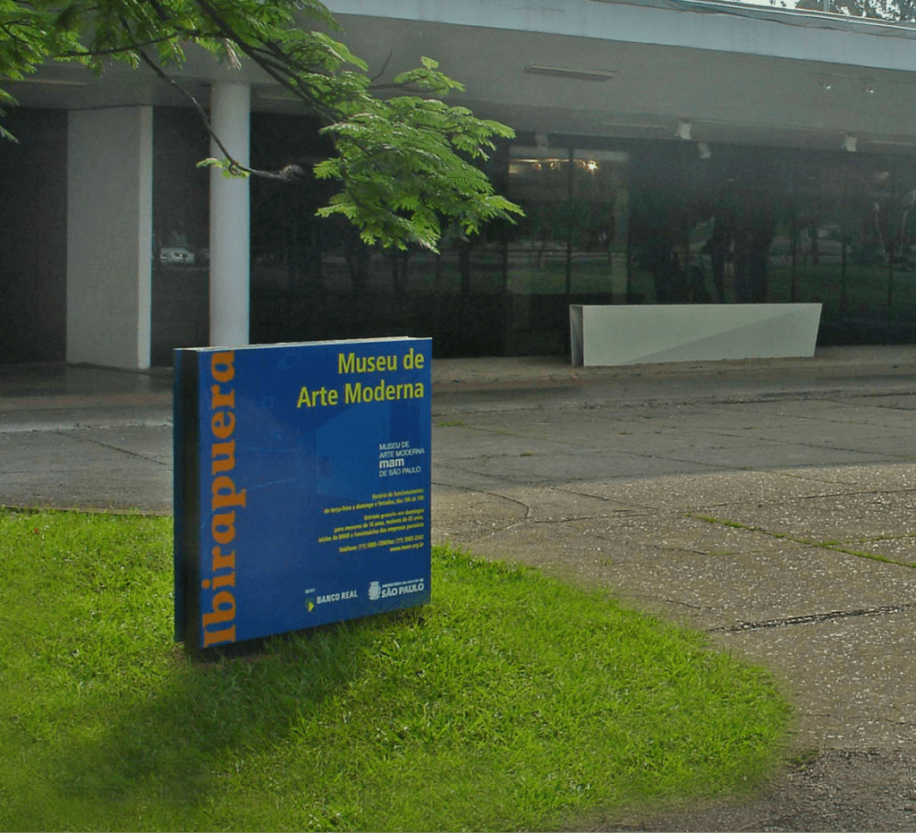
we created the logo and its system of relationship with the institutions that exist in the park.
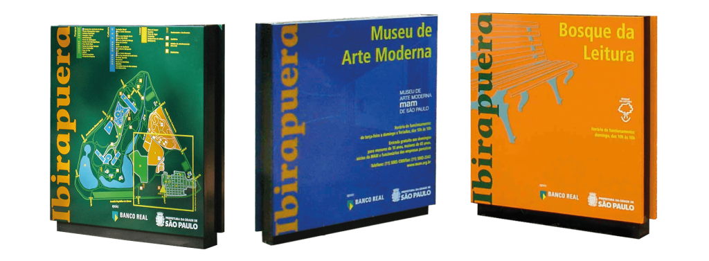
VISUAL IDENTITY
immediate recognition
we established a hierarchy for the nature of use of each space, assisting in defining pathways.
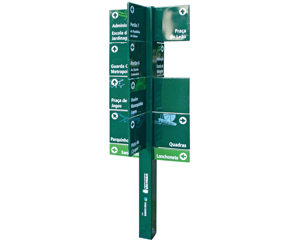
WAYFINDING SYSTEM
an infinity of pathways
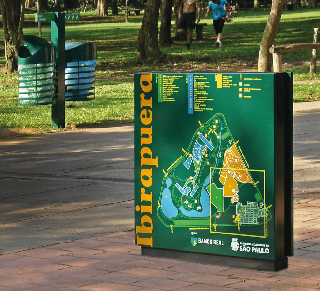
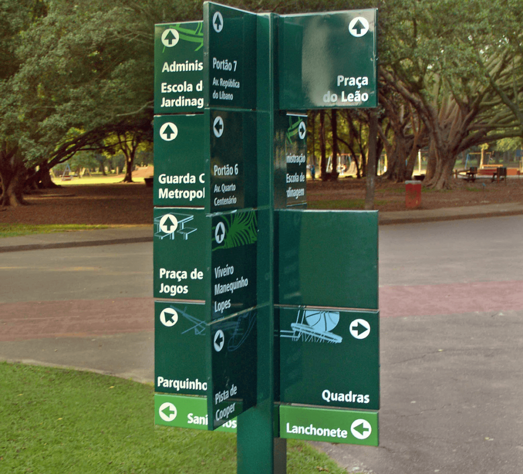
we created a wayfinding system with signs and maps that lead people to any location from any point in the park.
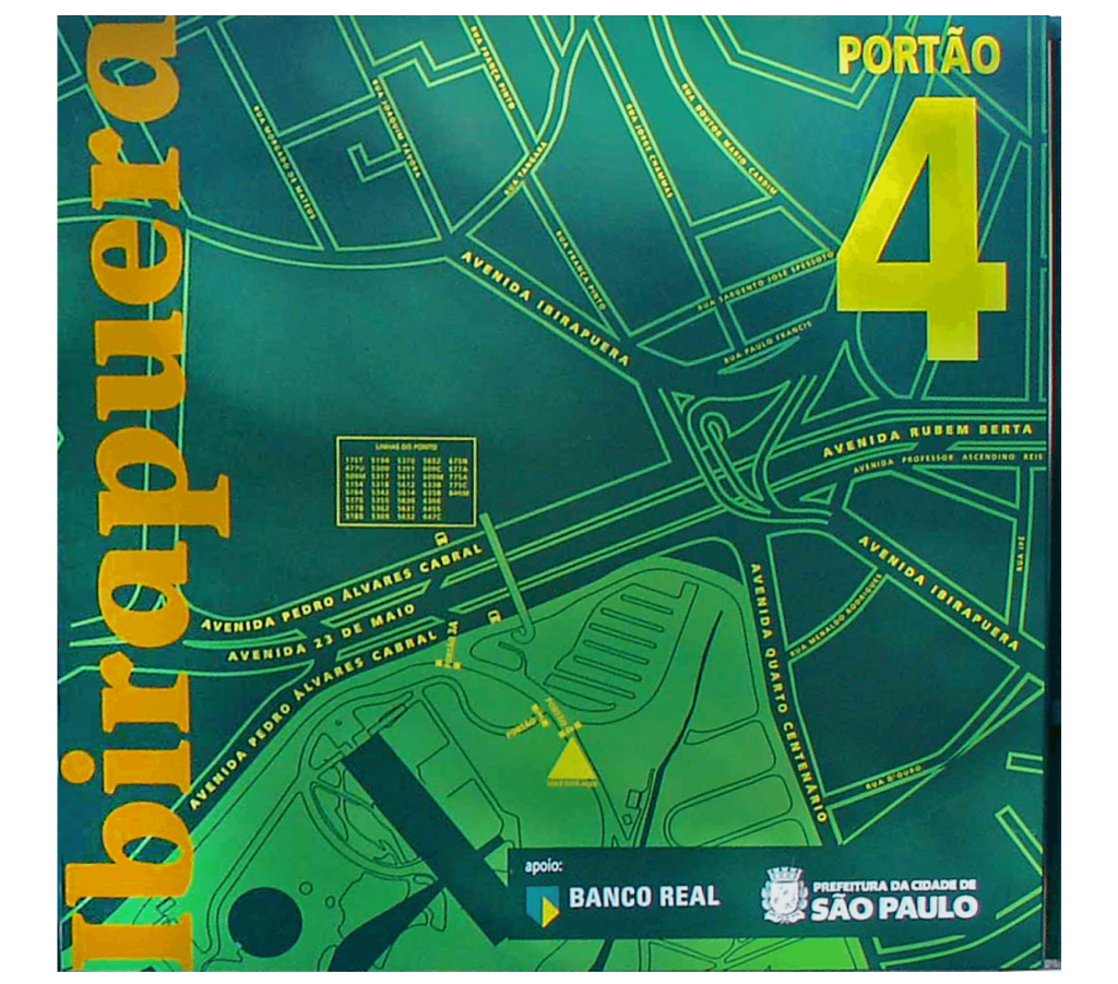
INTEGRATED SIGNAGE
right information at the right time
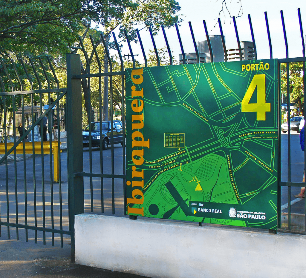
we designed maps of the surrounding area, with information on access and nearby bus lines.
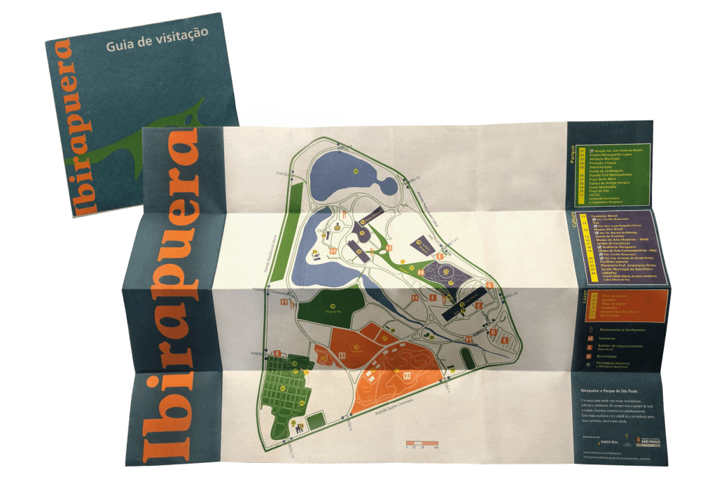
EDITORIAL
pocket map
we created a printed map that helps visitors during their visit and serves as a souvenir of the good moments experienced.
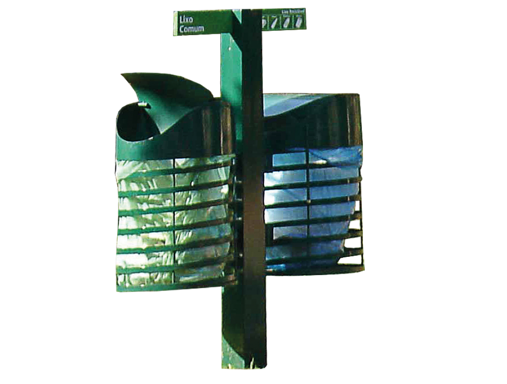
URBAN FURNITURE
trash in the right place
we incorporated the design of trash cans into the signage project to encourage recycling and cleanliness.
to enjoy the park
we blend identity with signage to encourage the discovery of everything Ibirapuera has to offer.
